Signage Design | Branding | Graphic Design
THE TERRACE
Australia
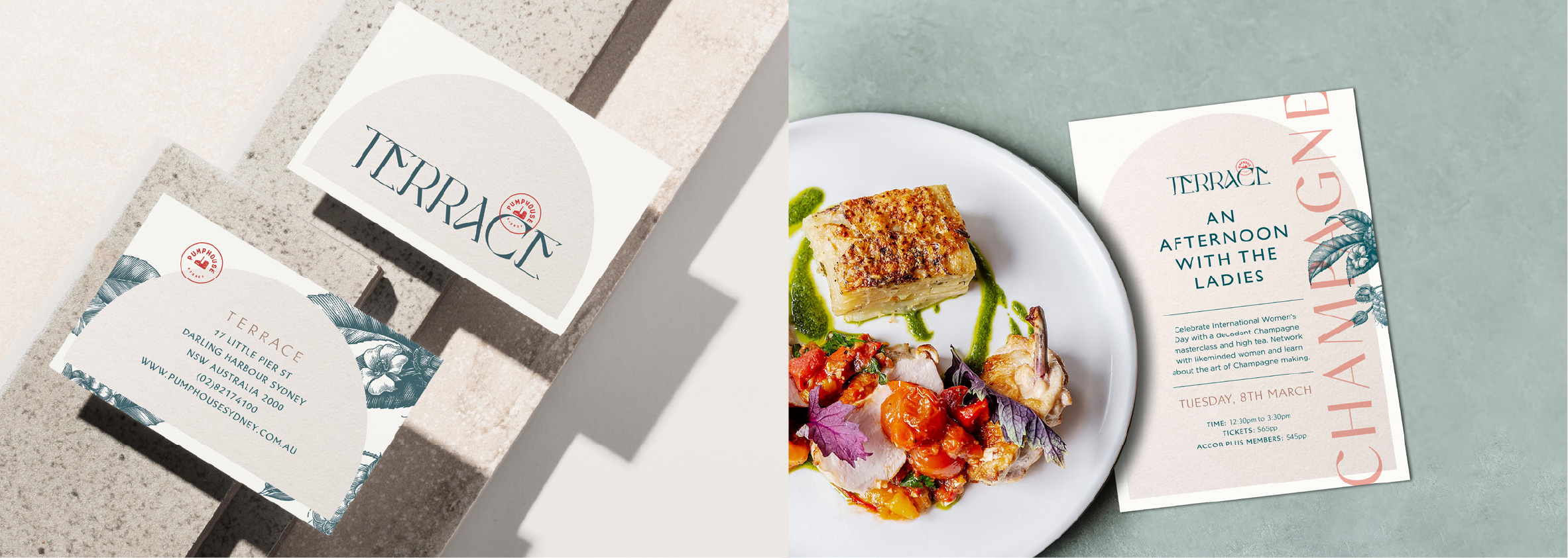
The stylish upstairs sister of the Pumphouse Sydney
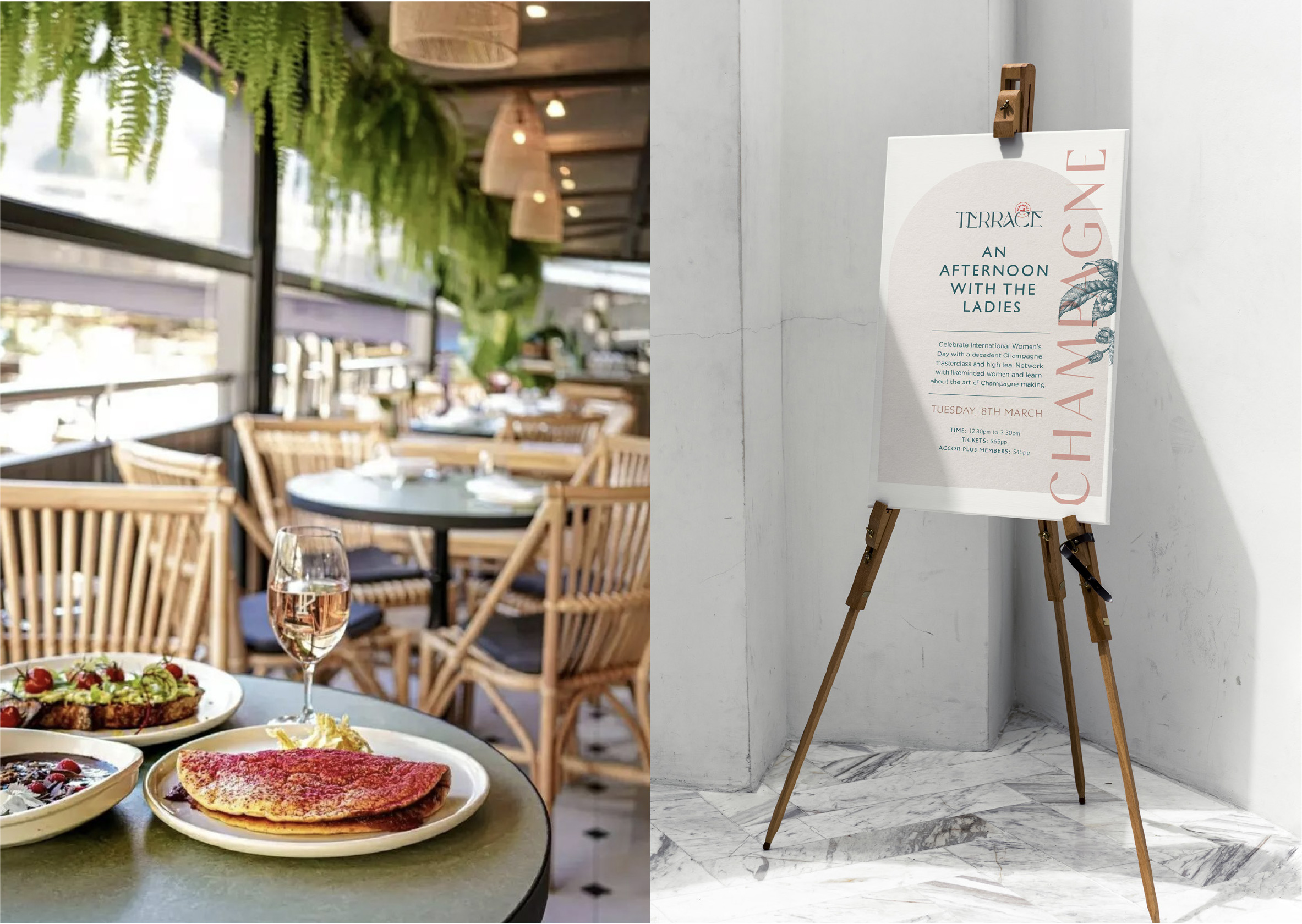
Curved arch-like shapes feature throughout the branding
reflecting the buildings architecture


Signage Design | Branding | Graphic Design


SIGNAGE DESIGN | WAYFINDING | F&B BRANDING
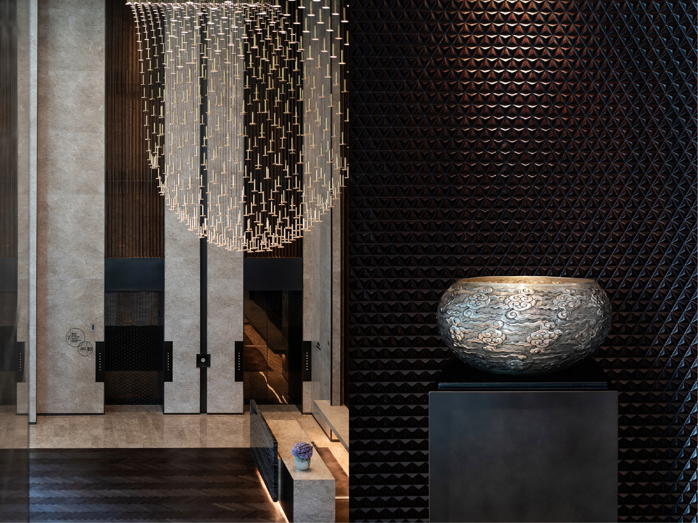
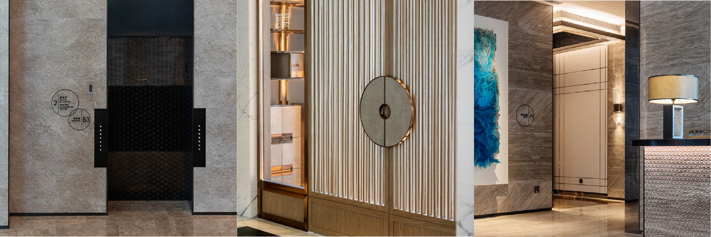
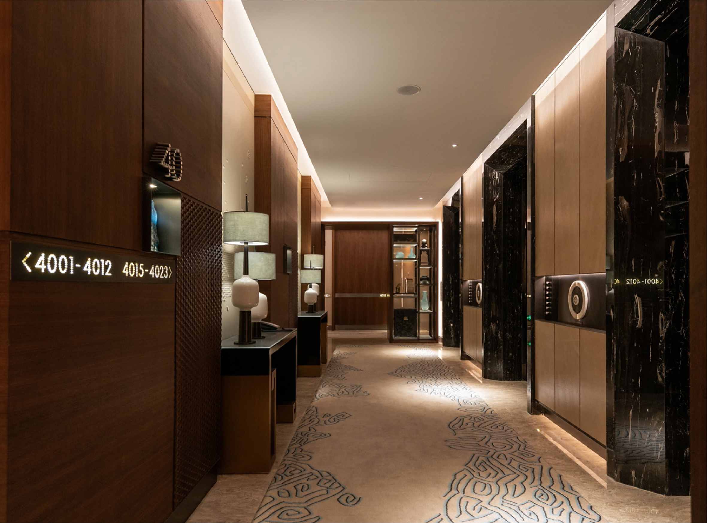
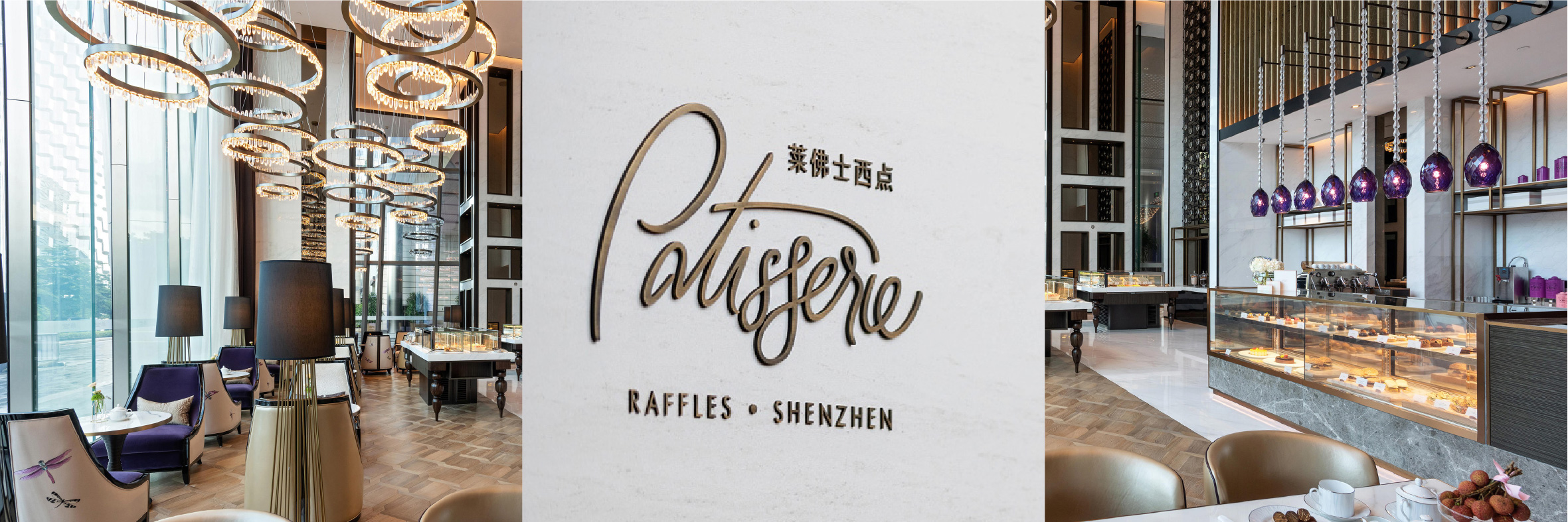
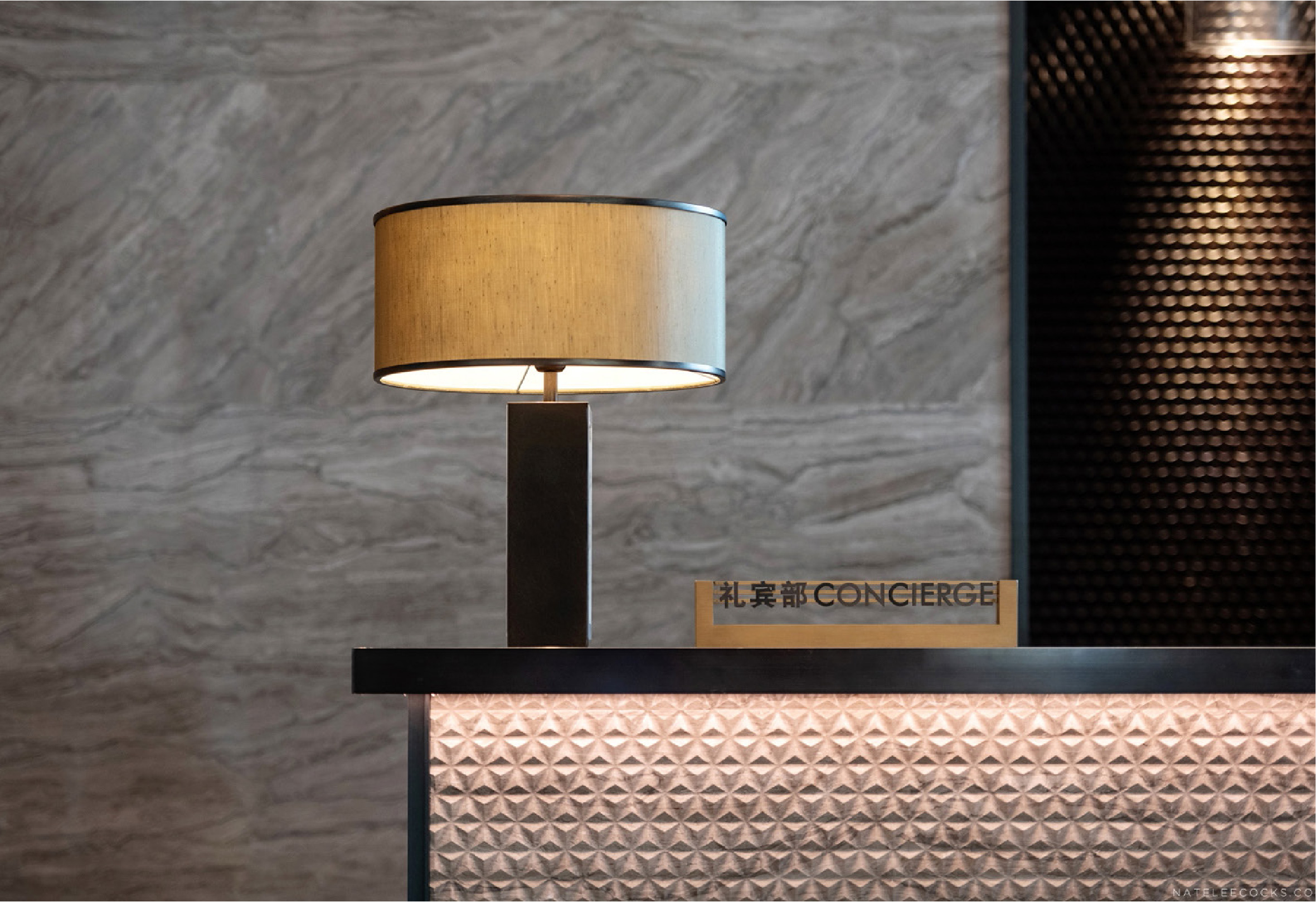
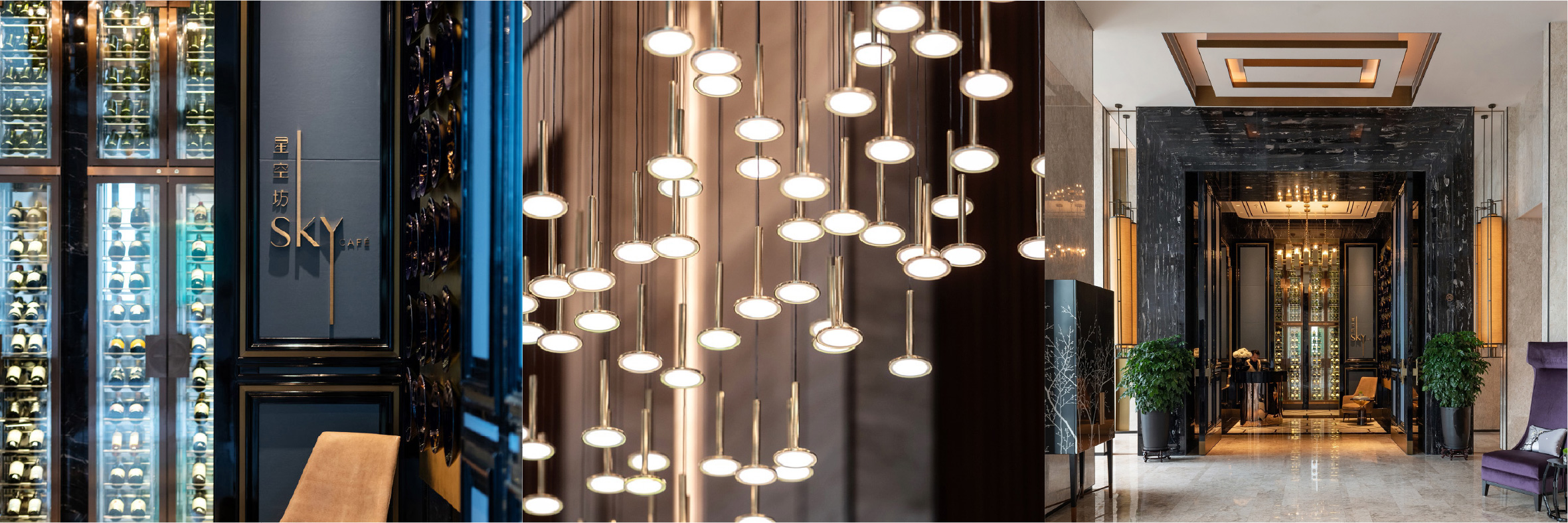
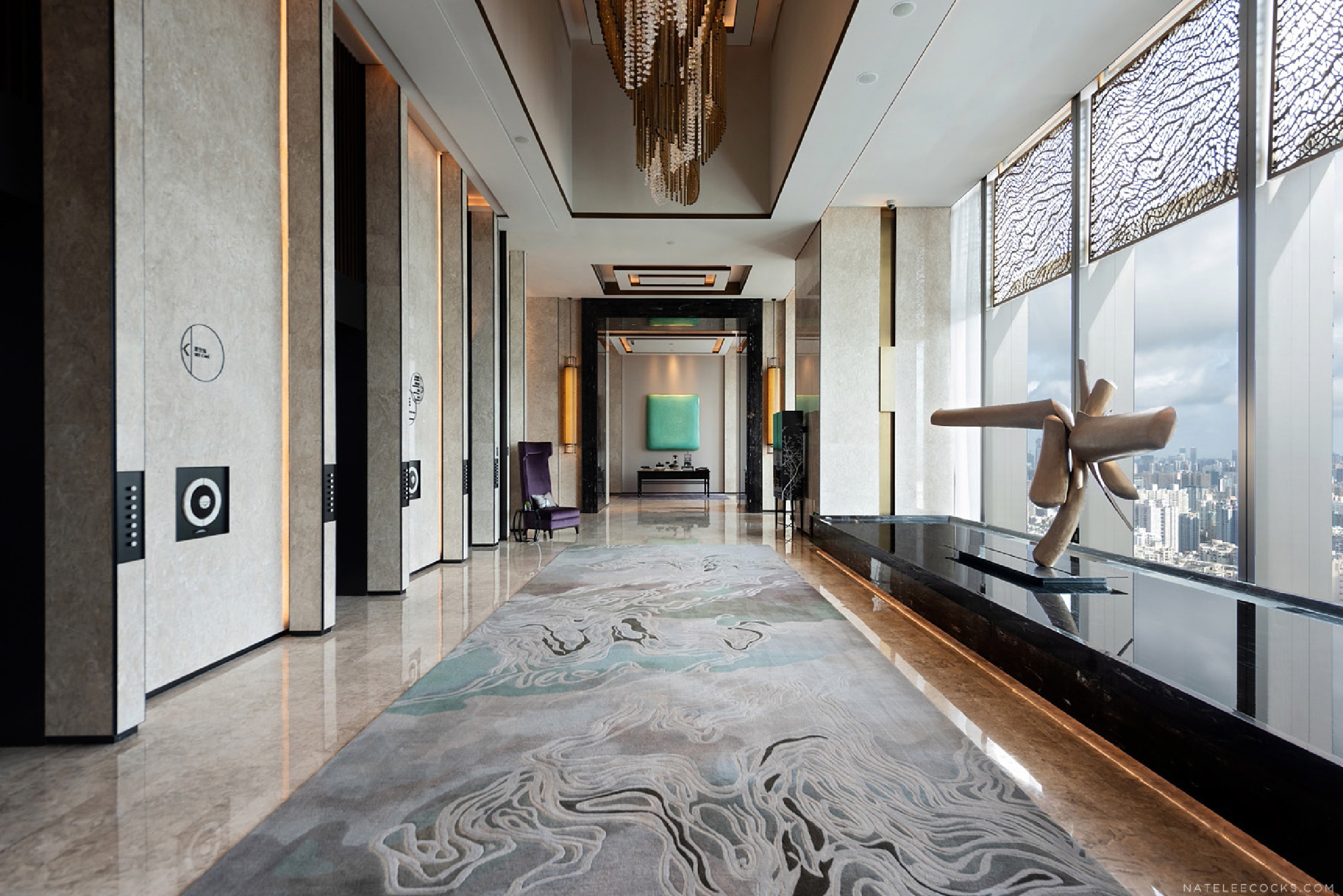
Interiors by LW Design / Architecture by KPF / Photography by Natelee Cocks
Signage Design | Wayfinding
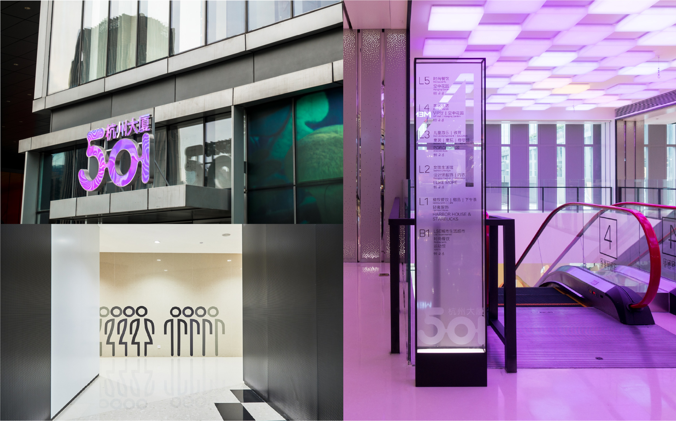
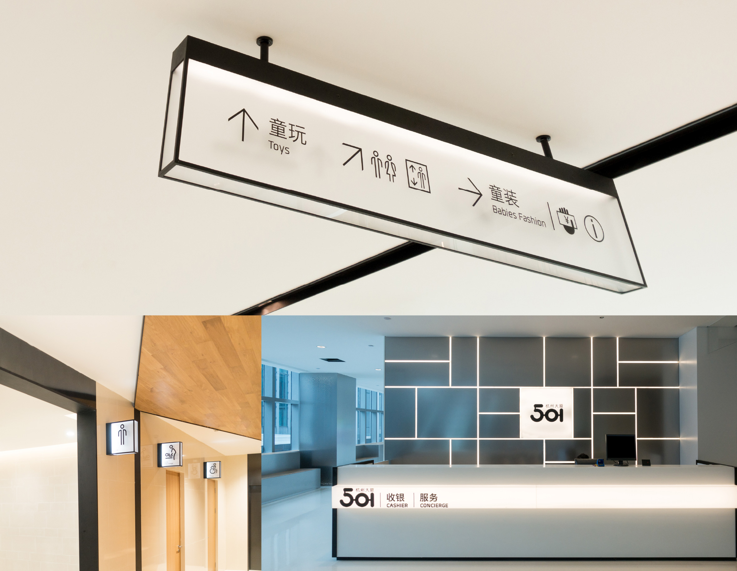
Set in the new commercial district of Hangzhou, China, Hangzhou Tower 501 brings together commercial offices, retail and residential. Spanning the lower six storeys, the 50,000m2 mall introduces a mix of retail, food and beverage, entertainment and lifestyle stores. Due to the large retail footprint, strategic wayfinding was critical to moving shoppers from one end of the mall to the other. In close collaboration with the client, Corlette advised on wayfinding user journeys that maximised the tenant lease strategy and contributed to commercial objectives.
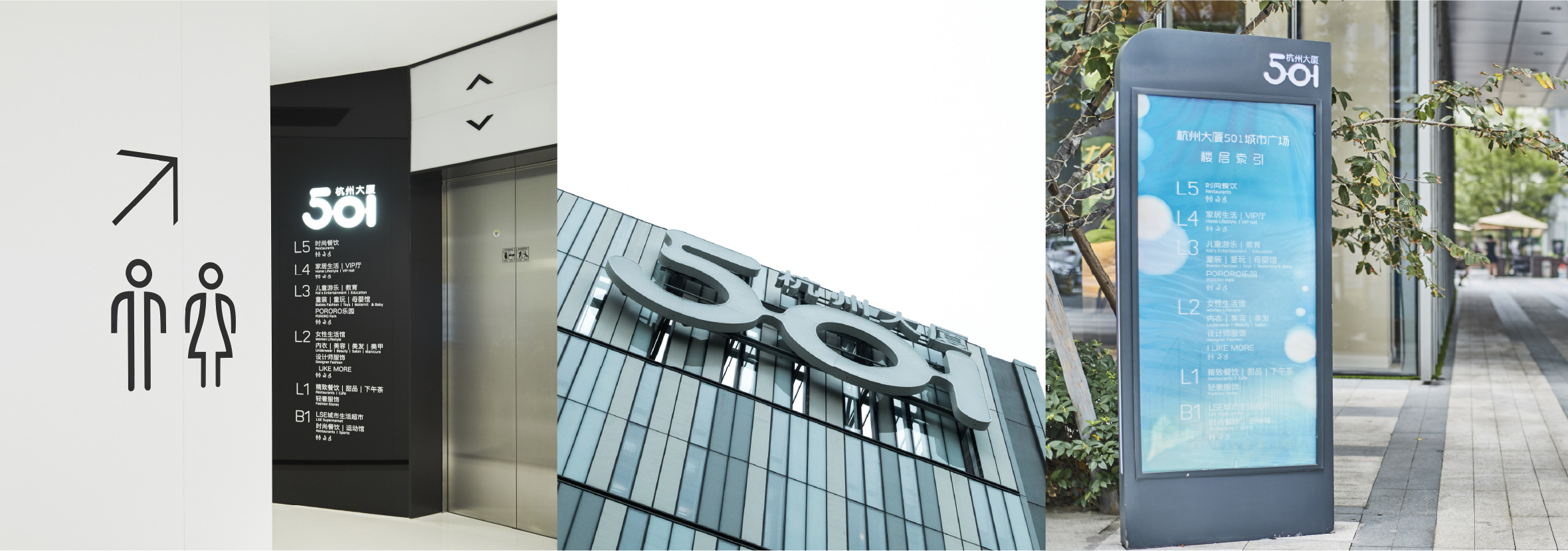
Corlette commenced the branding for the 501 retail mall and then carried this conceptual design through to the signage system for the whole commercial precinct. The signage concept is based on a girl’s delicately framed, glass jewellery box. An idea devised to celebrate all the precious and wonderful jewels to be found as part of the 501 shopping experience. This elegant visual theme is then consistently carried through various sign types, typography, and iconography. In addition, the landmark 501 entrance identification uses dichroic film to shift and coalesce various bright hues as the shopper moves around. This design also reflects the dynamic, colourful shopping experience within. The finished result is now recognized as an iconic, new landmark for the shoppers of Hangzhou.
F&B Branding | Packaging Design
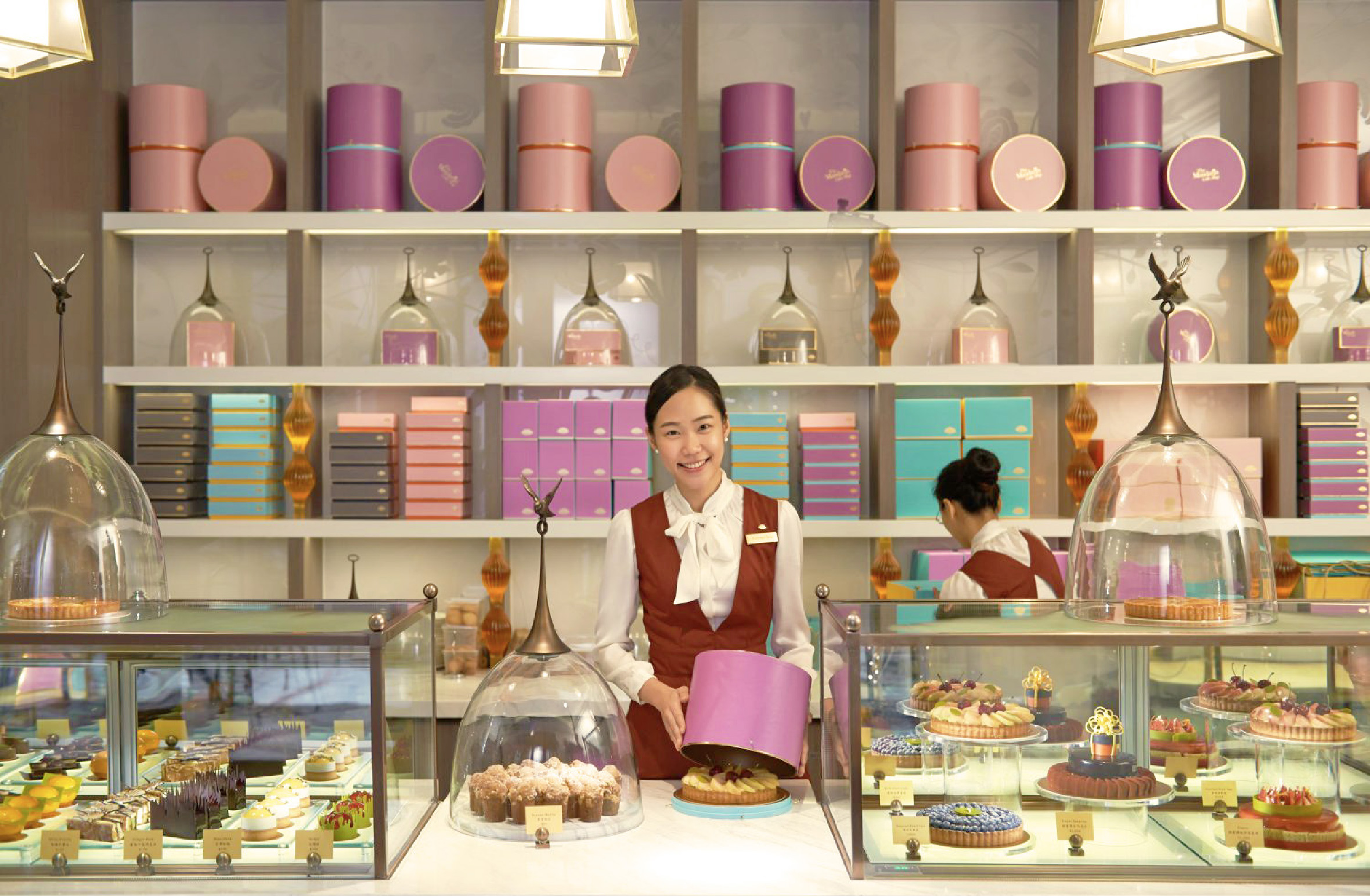
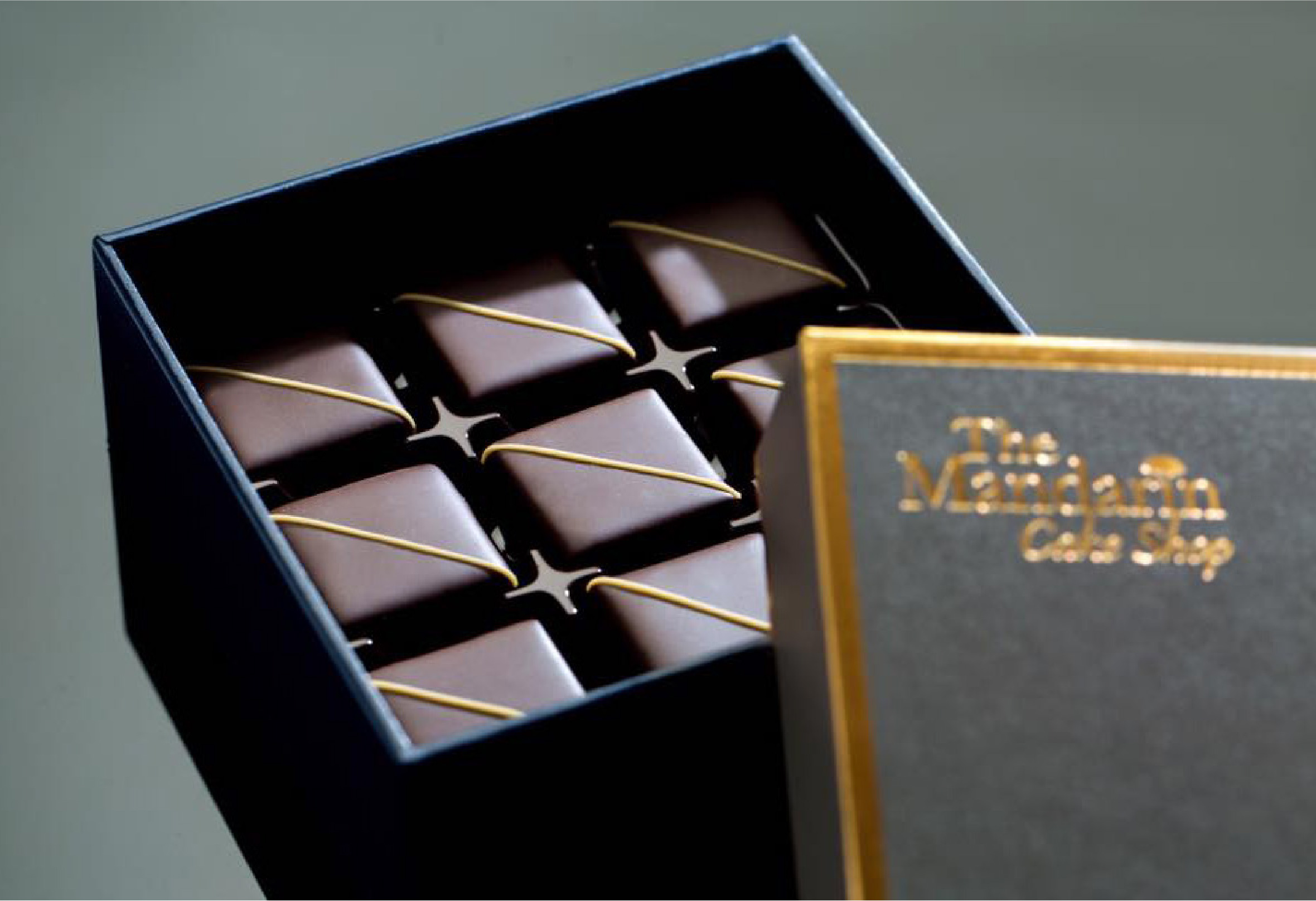
Life is sweet at the Mandarin Oriental, Taipei and it shows. Sparing no expense to deliver a level of service and experience beyond compare, the Mandarin Oriental Taipei proves too tempting for words. Originally engaged to develop the hotel’s branded collateral, Corlette delivered a mix of already established guideline brands and newly created F&B outlets. These included Mo Bar, Jade Lounge and the Oriental Lounge. The brief expanded to include iconic retail branding for The Mandarin Cake Shop.
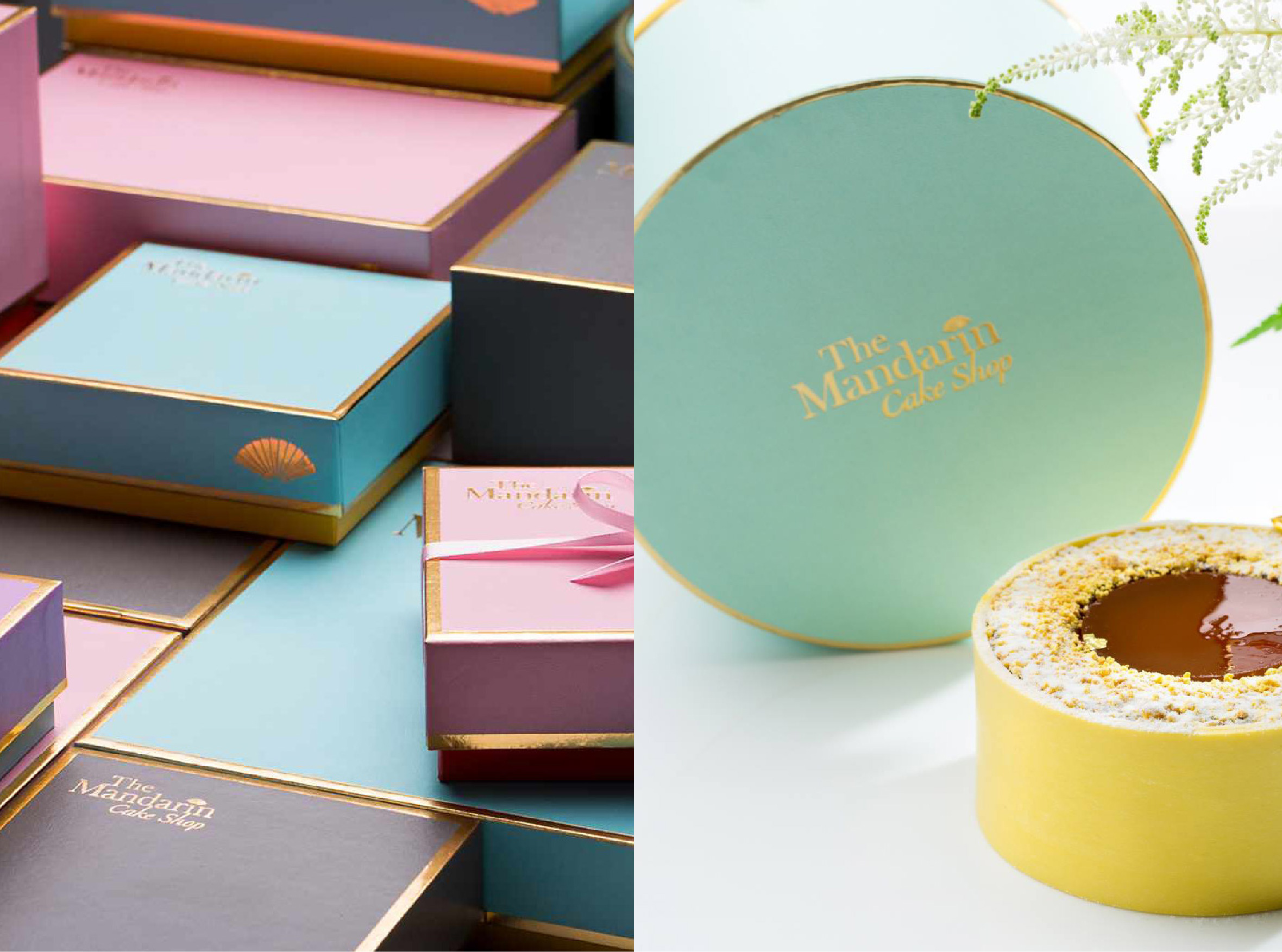
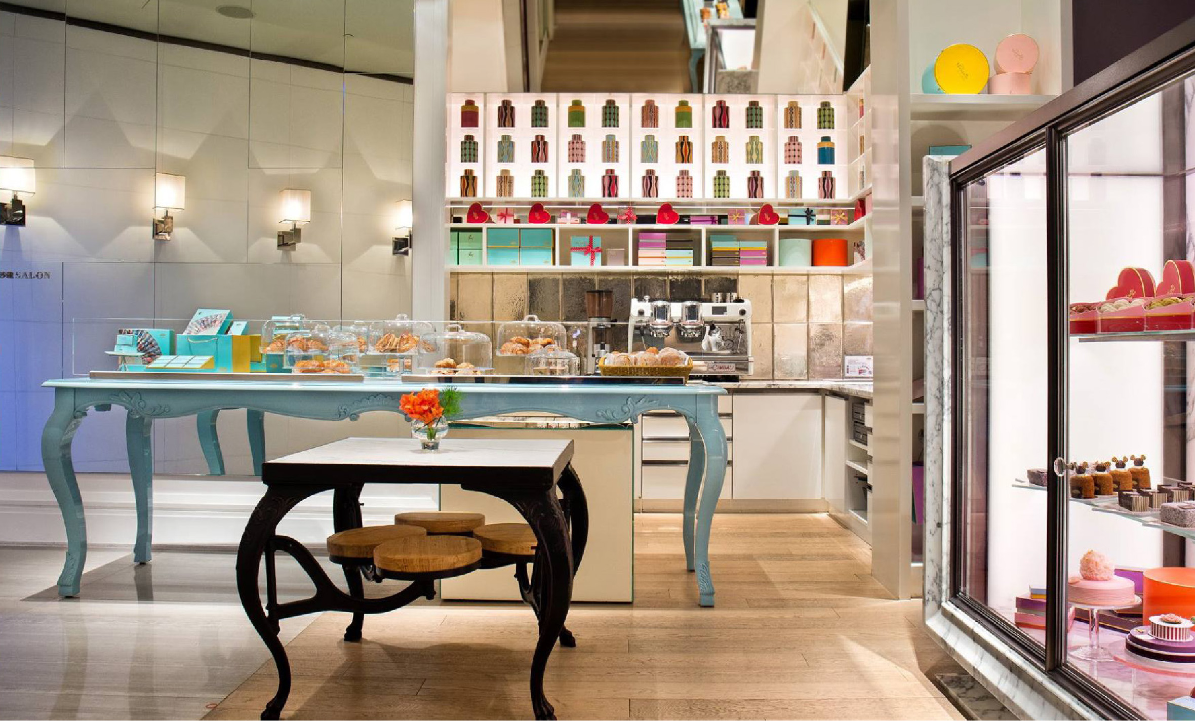
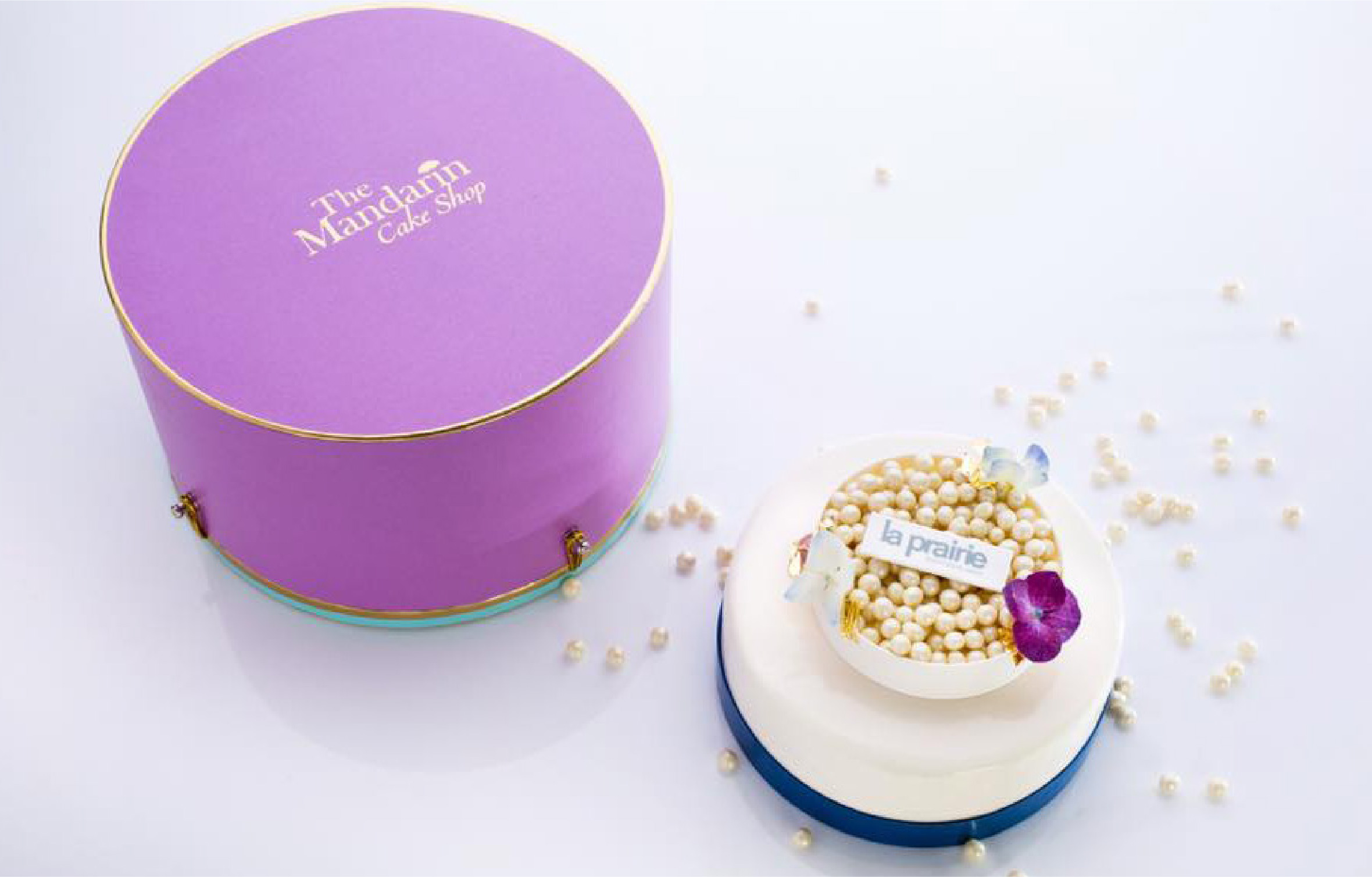
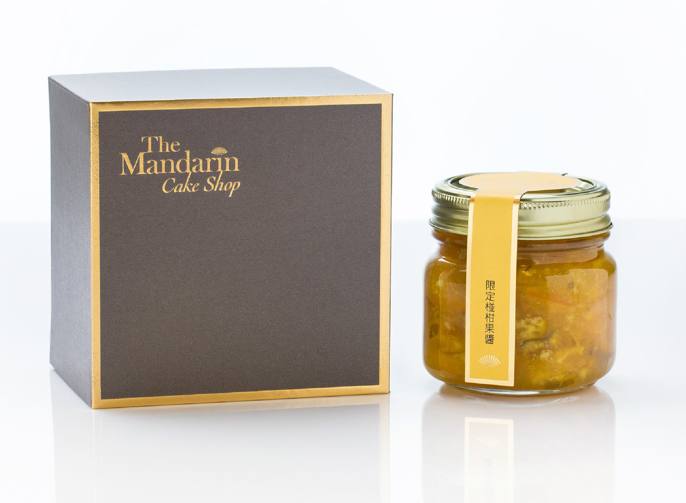
Working in close partnership with the senior marketing team and locally sourced suppliers, we set about creating a range of delicious brand packaging. The indulgent, sugar palette is enhanced with a touch of golden opulence. Created as a brand signifier, the packaging is designed for cakeshop customers to parade, display and delight in. Corlette delivered an original brand packaging suite that included over 140 individual items.
Signage Design | Wayfinding | F&B Branding
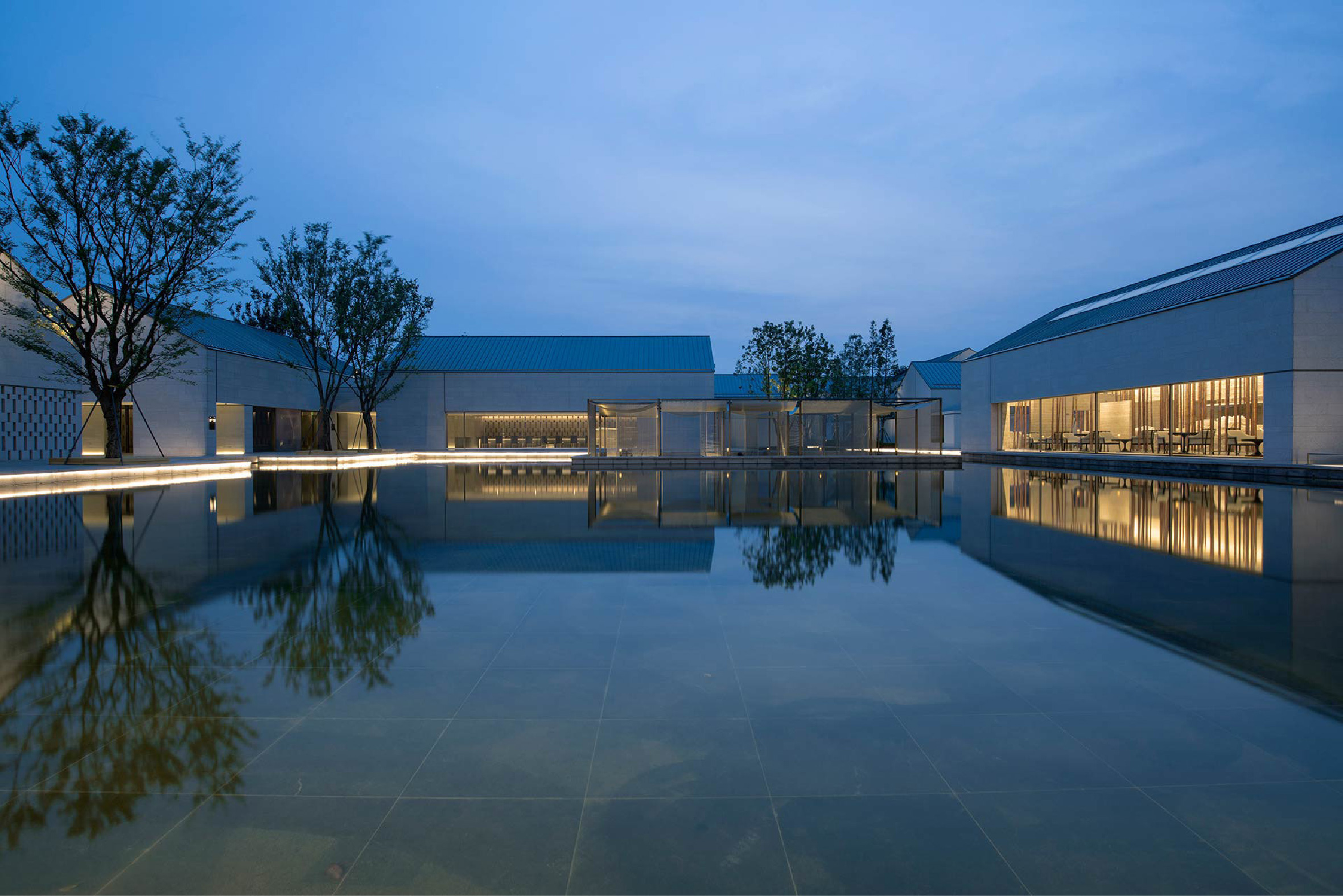
Brand Design
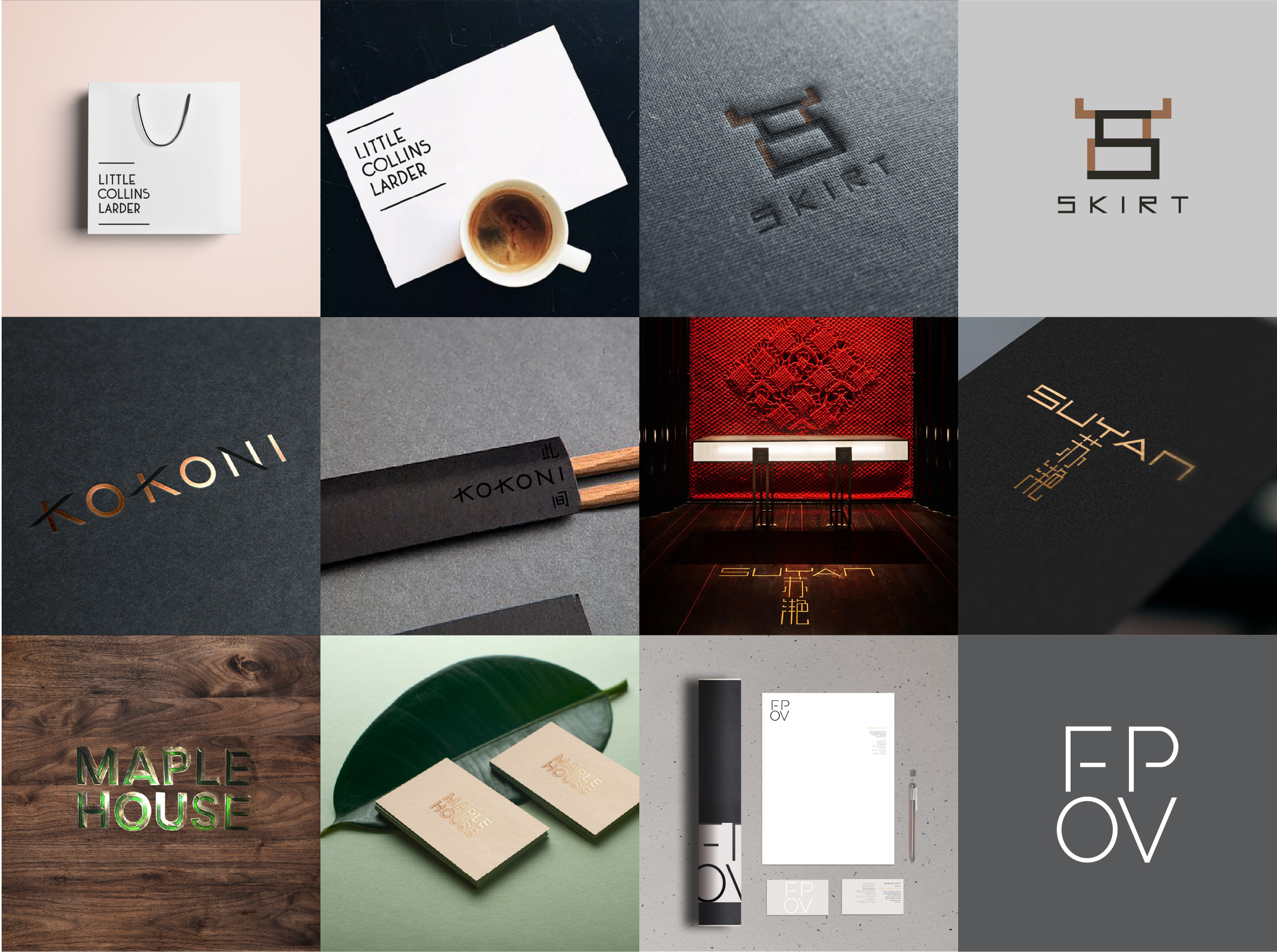
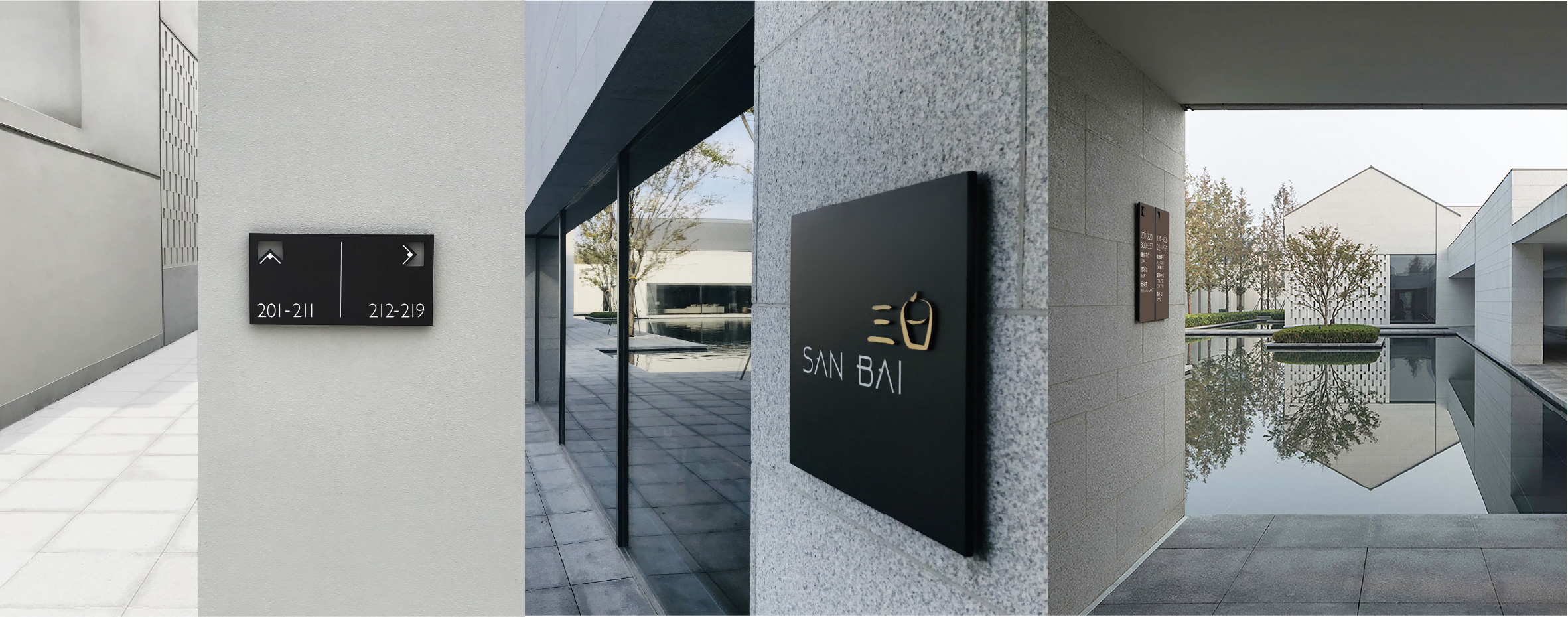
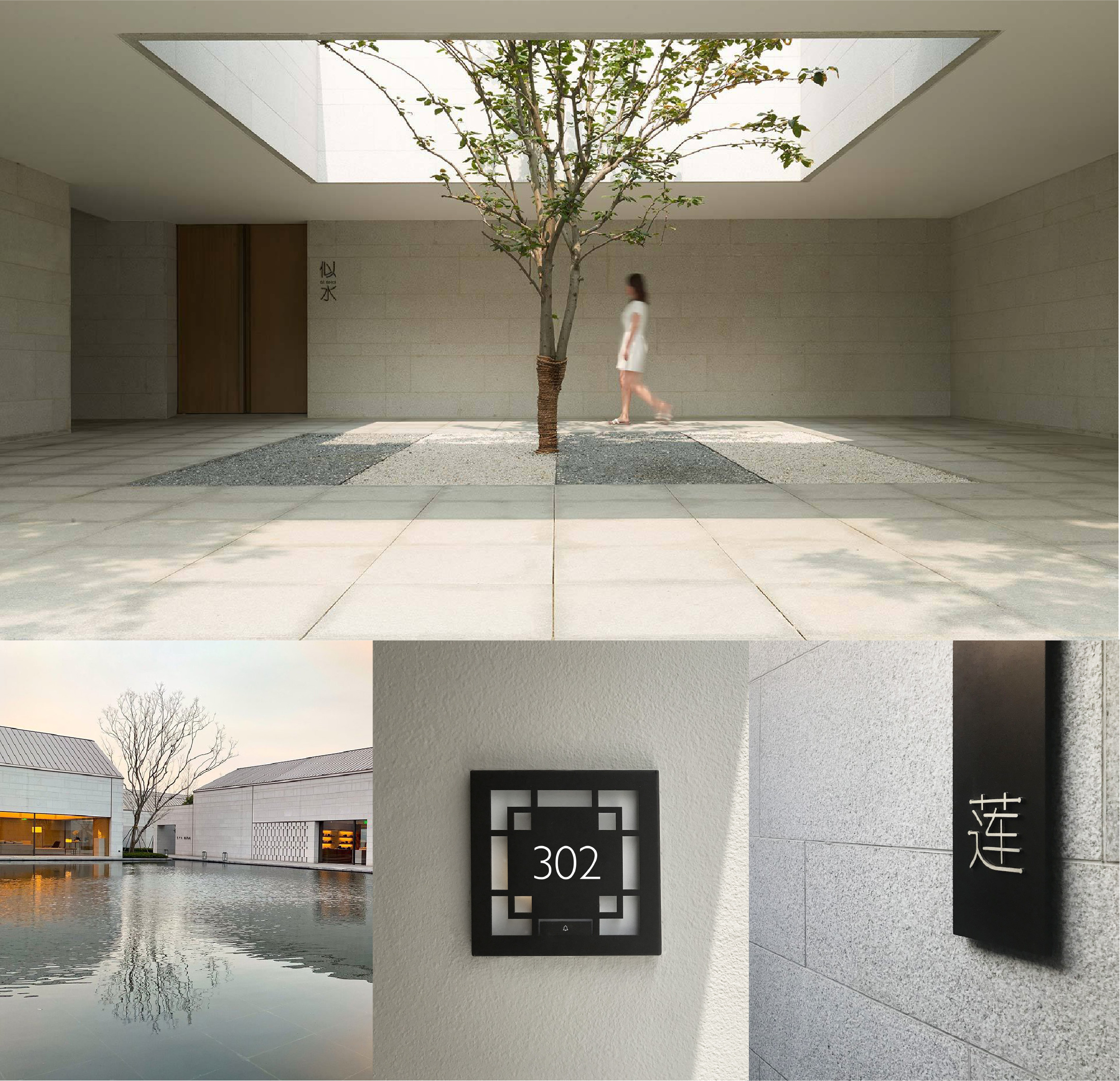
Signage Design | Wayfinding
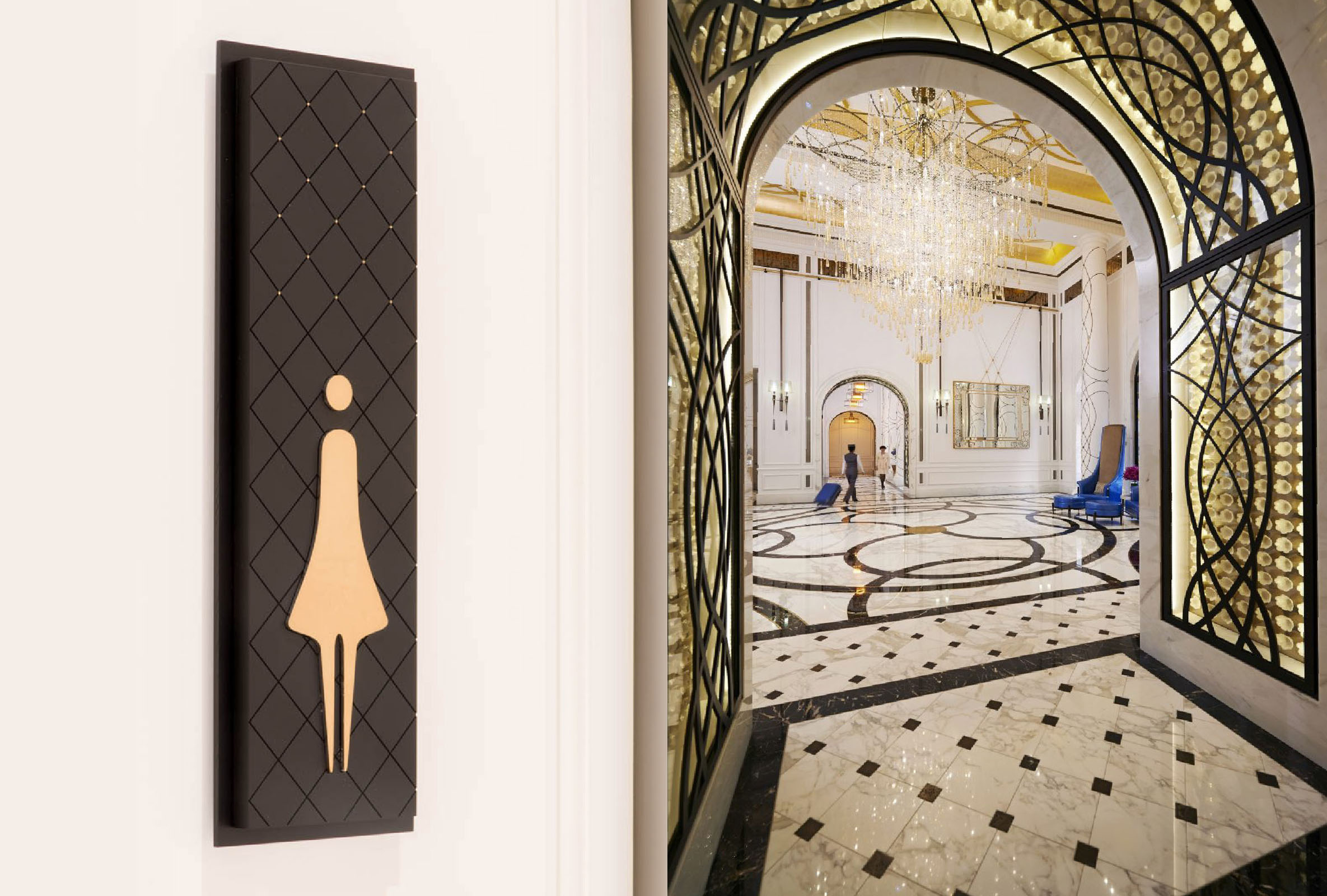
Setting new standards for hotel luxury, Mandarin Oriental Taipei opened its doors in December 2016, a five-star urban retreat in the heart of the city. With sophisticated design, exquisite restaurants and the largest hotel spa in Taiwan, this luxury escape offers a truly unforgettable experience.
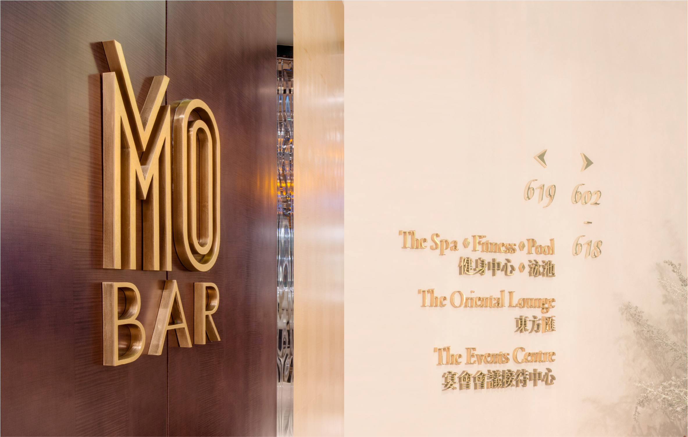
In a bold scheme that borrows from classical European architecture; open air courtyards, formal landscaping, garden terraces and water fountains reminiscent of grand Italian and French residences, the hotel transports you to the golden era of hospitality. The challenge for our signage and wayfinding program was to bridge the divide between modern sensibilities and classical European charm. Mandarin Oriental Taipei signage and wayfinding draws inspiration from signature interior design details. Parquetry patterns are repeated in chocolate engraved and gold-leaf studded interior signs and rich, exquisite gold lettering takes centre stage. Sophisticated materials, considered typography and attention to detail are all reminiscent of old world elegance.
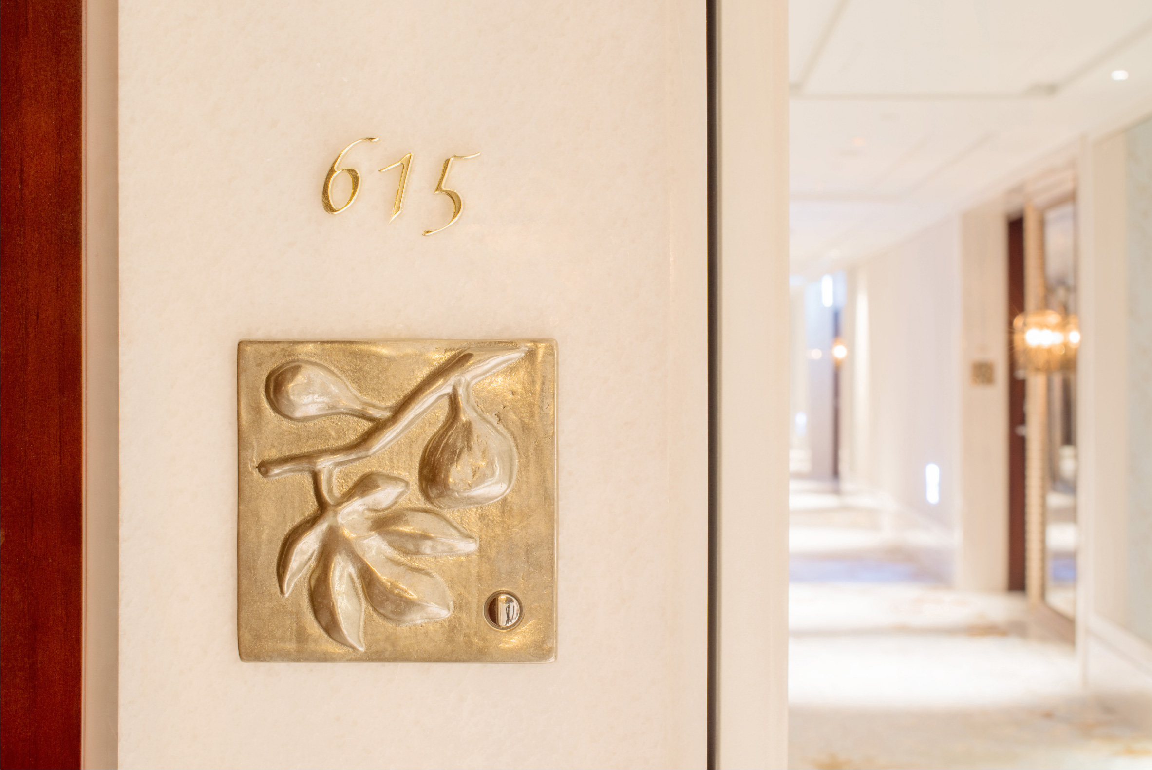
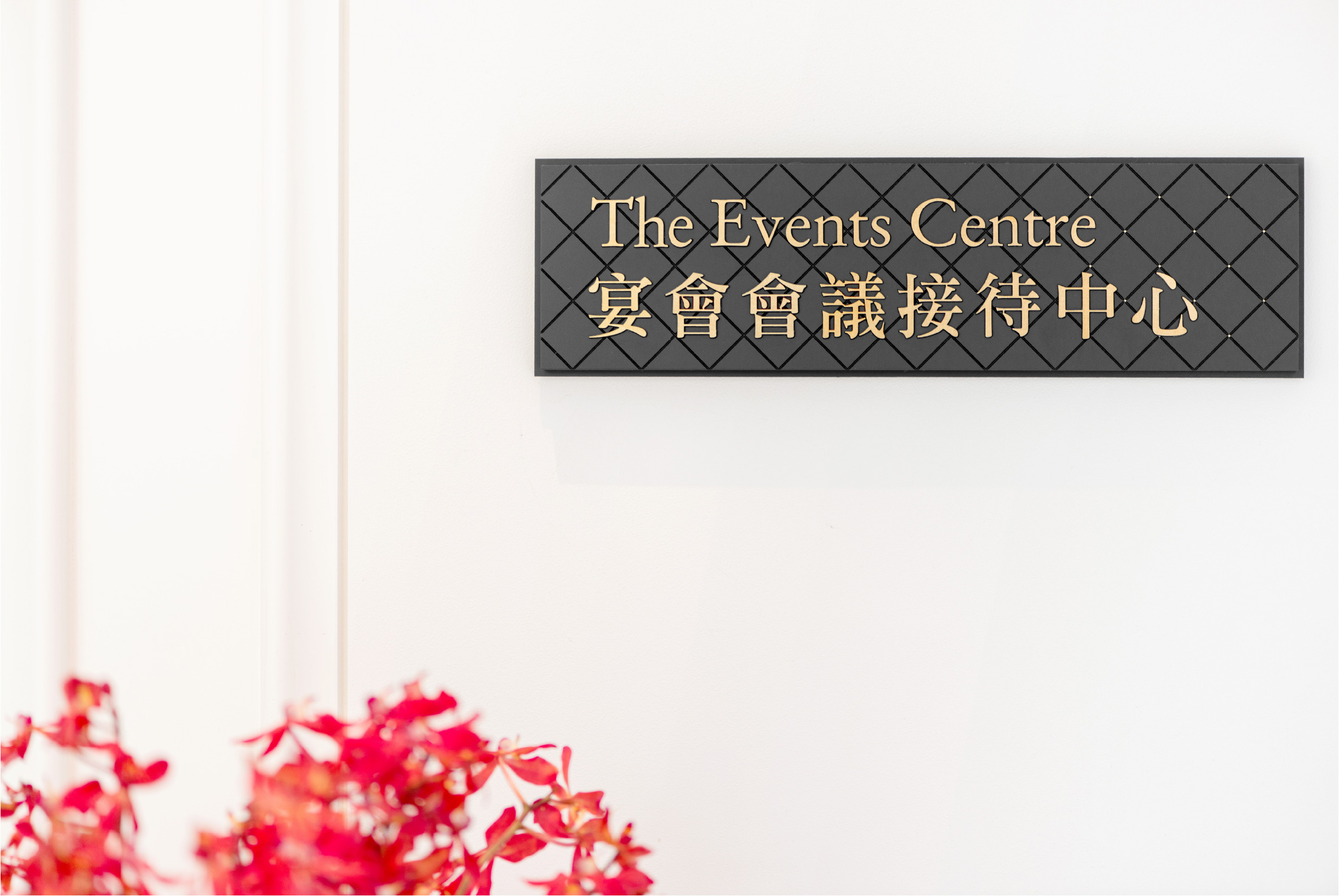
Corlette also crafted branding and design for the hotel’s Lifestyle and Food & Beverage outlets. Iconic, sugarcoated branding for The Mandarin Cakeshop and the sophisticated, elegance of the M.O. Bar identity are standouts.
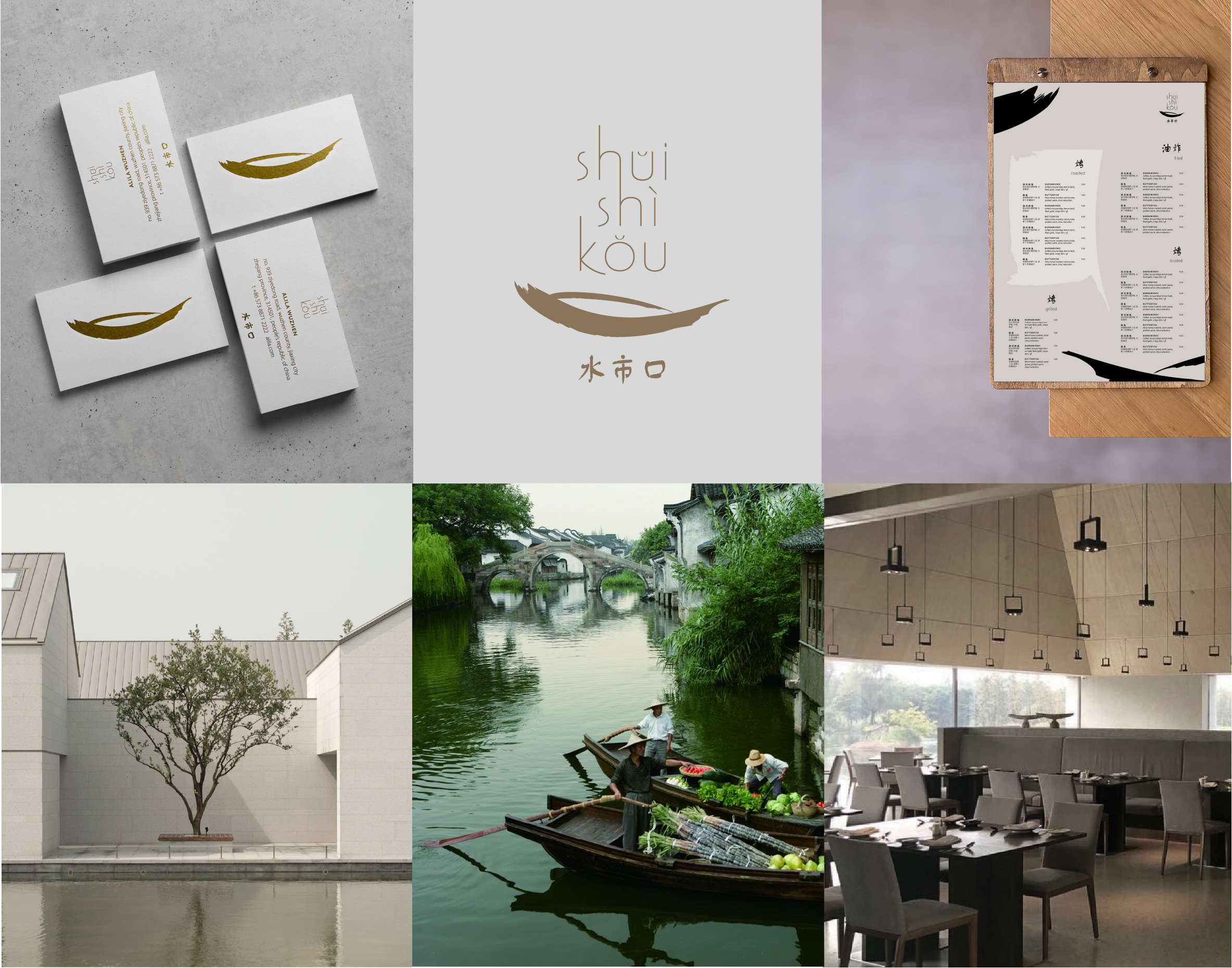
Branding | Graphic Design
Branding | Graphic Design | Packaging Design
