Signage Design | Wayfinding
PARK HYATT
Sydney, Australia
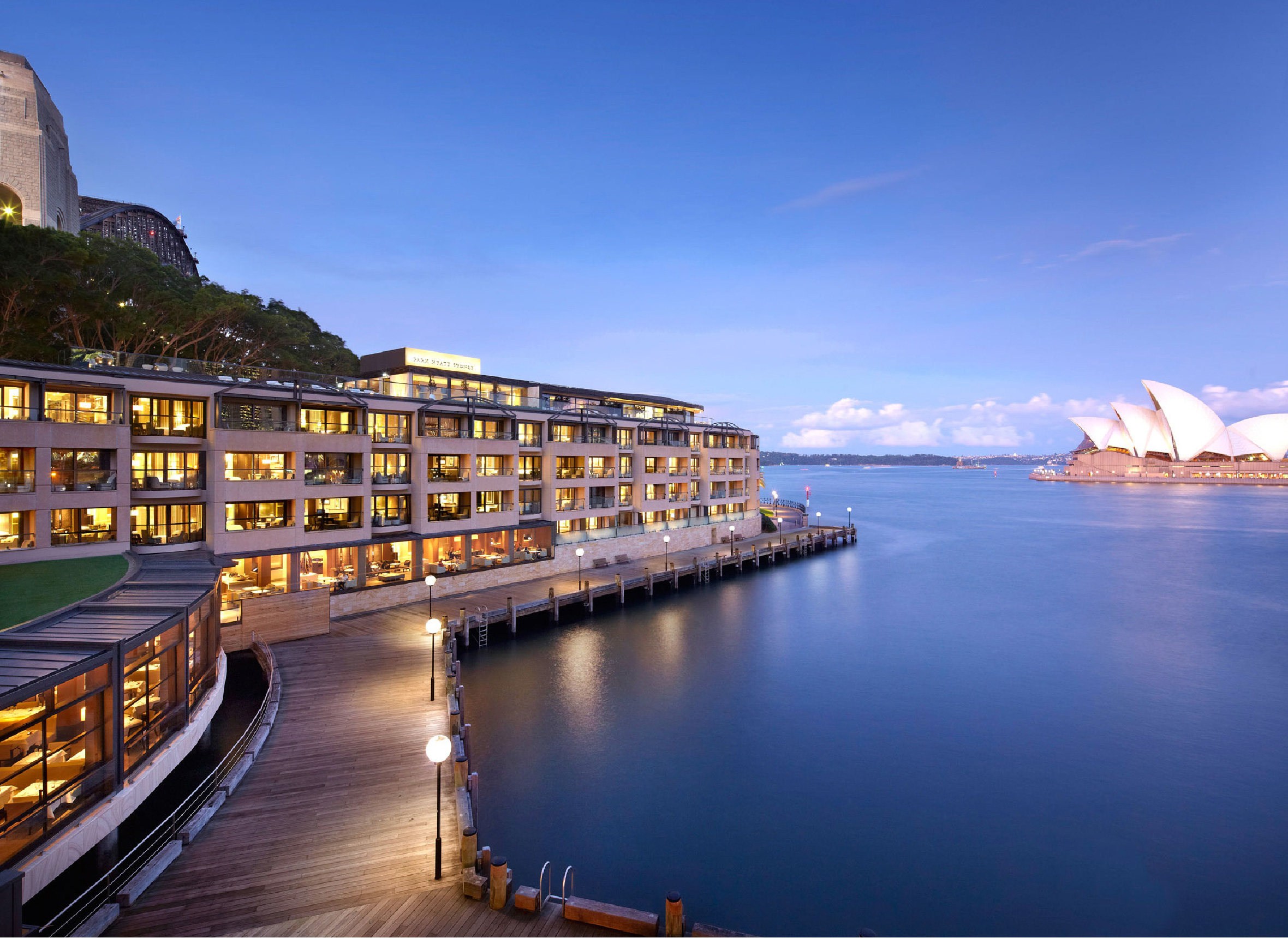
As simple as the Opera House is bold, the new design is now considered the gold standard for Park Hyatt worldwide.

A new classic
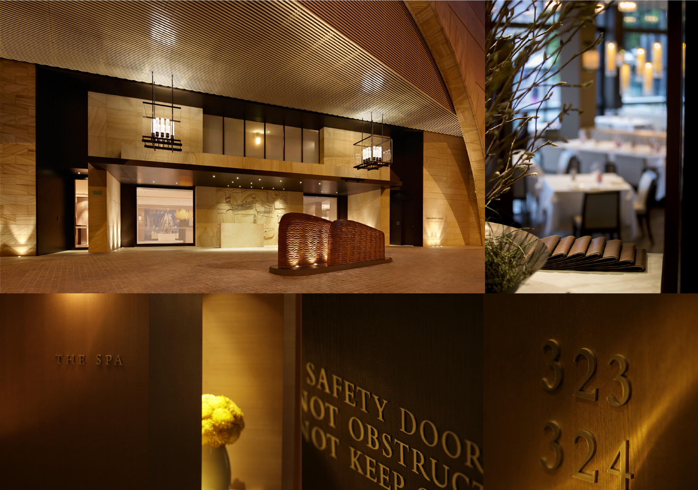
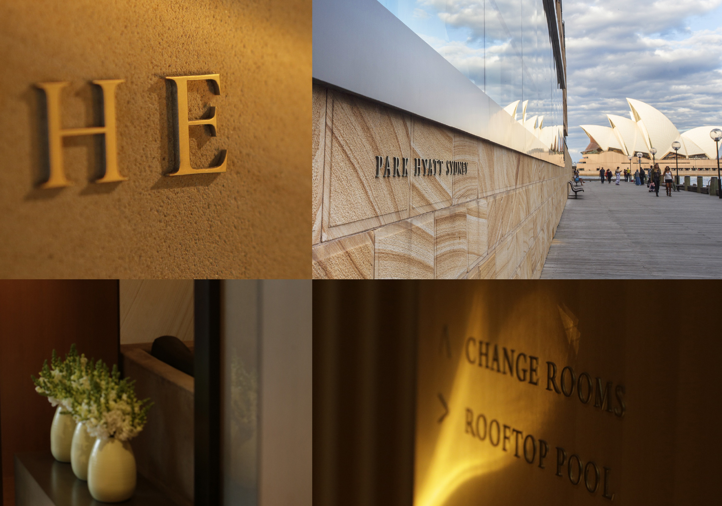
Our brief was to establish a new 20th Century classic look and feel for the hotel, across signage and graphics, appropriate for one of the world’s leading luxury brands. Defining a position and style in-keeping with the brief, we designed for an intimate and welcoming space more akin to a home than a hotel. Our approach is pared-back, refined, and elegant, The choice of materials and use of language creates a solution as unobtrusive and understated as possible. Minimalist typography, stylish black and white photography, honest materials and simplicity in F&B naming, for The Dining Room and The Bar, combine in a stylish and elegant solution that designed to be seen and not heard.

